Accessible React Native and Expo component library styled with Tailwind CSS.
Included Components
192
PanelUIGitHub repository696Get startedTroubleshootingUpgradingNative renderingPerformanceColorsFontsIconsStylingAISetupAPI routeChat UIVoiceStreaming performanceAccordionAlertAnimatedBadgeAttachmentAvatarBadgeBottomSheetBreadcrumbButtonButtonGroupCalendarCardCarouselCheckboxChipCircularTextCollapsibleColorPickerComboboxCompareContextMenuDatePickerDateTimePickerDialogDirectionDrawerEmptyStateFabFieldFlipCardFlowFrameGridItemImageViewerInputInputGroupItemKpiLabelLoaderMapMarkdownEditorMarkerMarqueeMenuMessageMessageScrollerMeterNumberInputOtpInputPageHeaderPaginationPlannerPopoverPostProgressProgressButtonQRCodeQuestionnaireRadioGroupRatingScrollBlurScrollCanvasScrollFadeScrollHeaderScrollTextSearchBarSectionProgressSectionRailSelectSelectionModeSeparatorSignatureSkeletonSketchSlideButtonSliderSortableSpinnerSplitterSplitViewStackCardStepsSurfaceSwipeSwitchTableTabsTagInputTextAnimationTextareaThemeSelectorTimelineTimePickerToastToggleButtonTooltipTourTreeAreaChartBarChartBubbleChartBumpChartCandlestickChartFunnelChartHeatmapChartHexChartLineChartLiveLineChartMirrorAreaChartPieChartPlotPolarAreaChartPyramidChartRadarChartRingChartSankeyChartScatterChartTreemapChartWaterfallChartaiInputCodeBlockImageGenerationPanelsidePlanReasoningResponseShimmerSoundwaveSourcesTaskThinkingOrbFormuseCopyToClipboarduseDirection and useDirectionSignuseDisclosureuseBreakpointuseKeyboarduseKeyboardAvoidanceuseRevealProgressuseScrollSectionsuseSkeletonHandoffuseDebouncedValueusePrevioususeBackHandleruseTheme and useThemeModePublic APIComponent APIHooks APIUtilities APIFoundations APIIcons APINeonLogo MakerpanelwindQuickstartConversationsIdentify usersAPI referencecnActionsForms and inputOverlaysNavigationLayout and structureDataFeedback and statusMedia and motionAI componentsBottom SheetDialog & PopoverForm & SelectToast & NotificationsLine Chart & Data CardsFile Attachments
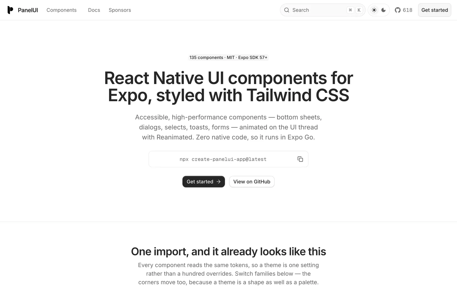
PanelUI is an accessible, high-performance component library engineered specifically for React Native and Expo. Powered by Uniwind (Tailwind CSS v4 for native) and Reanimated, its components run smoothly on the UI thread and work out of the box in Expo Go with zero native code dependencies. It spans comprehensive primitives including bottom sheets, dialogs, forms, toasts, and charts with unified theme token switching.