shadcn/ui

Curated collection of 55 open source UI libraries and design engineering components for shadcn/ui. Explore component lists, live previews and code repos.

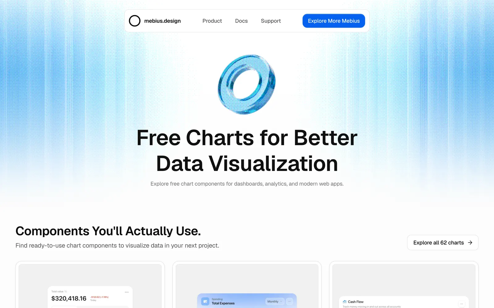
Mebius Charts — Animated React chart components and Figma assets built with Tailwind for shadcn CLI.

Mebius ChartsData Viz

Animated React chart components and Figma assets built with Tailwind for shadcn CLI.

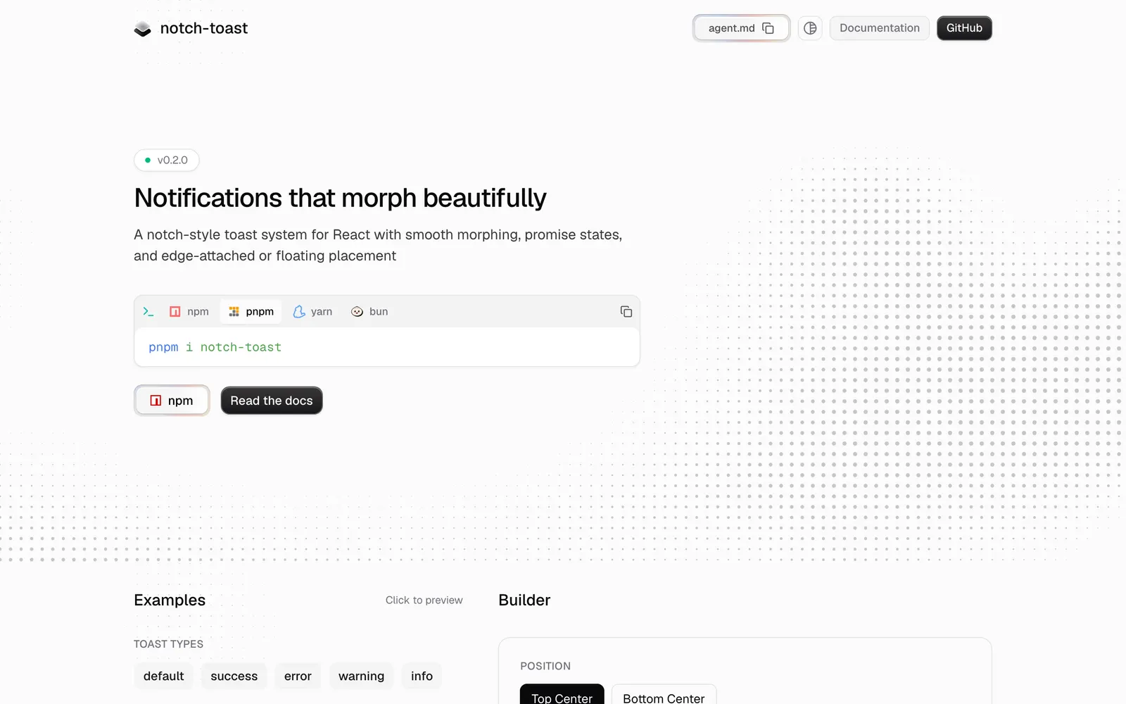
Notch Toast — Smooth morphing notch and floating toast notifications for React powered by Motion.

Notch ToastLoading & Feedback

Smooth morphing notch and floating toast notifications for React powered by Motion.

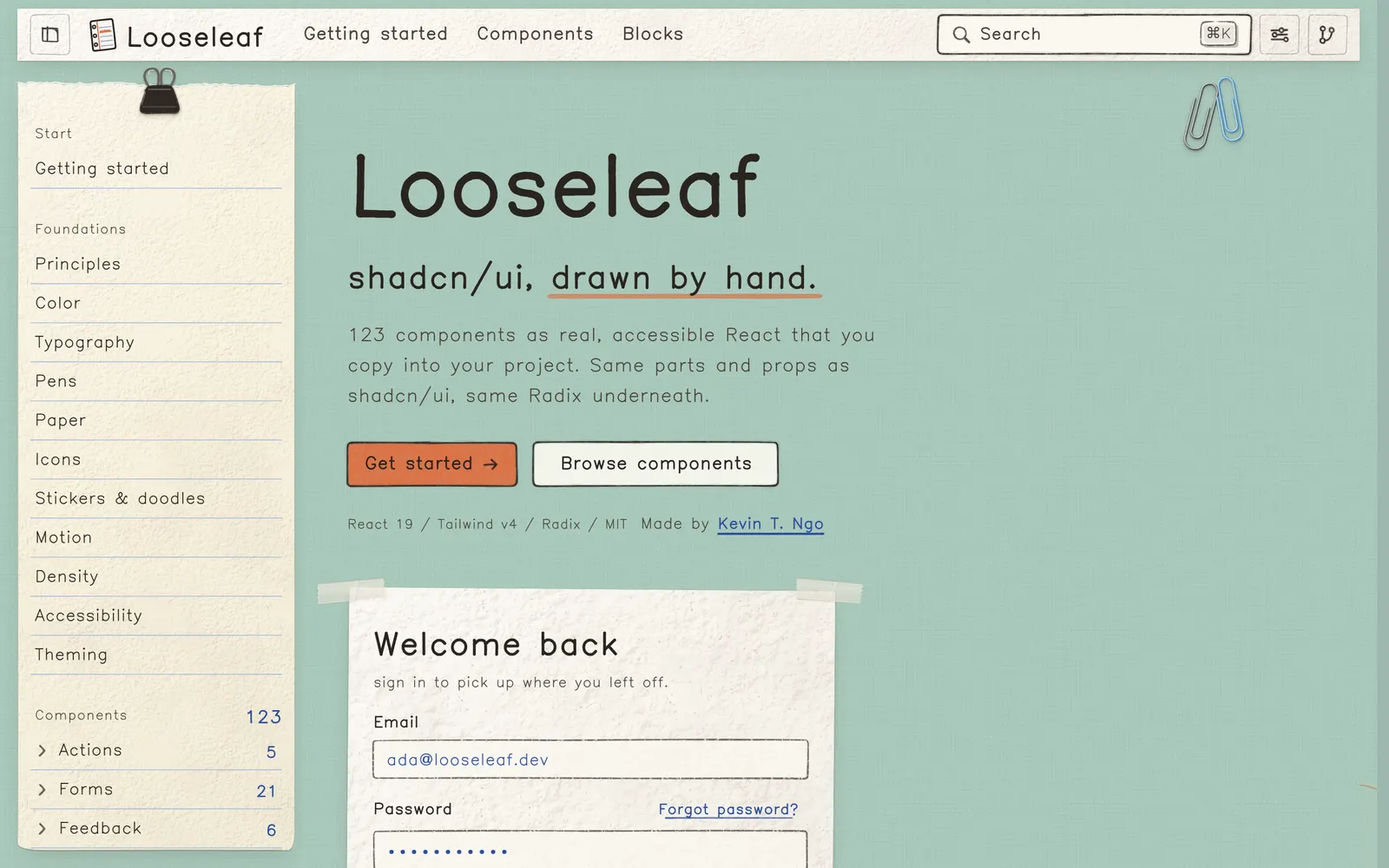
Looseleaf — Hand-drawn React components and shadcn registry where every surface is paper.

LooseleafCollections

Hand-drawn React components and shadcn registry where every surface is paper.

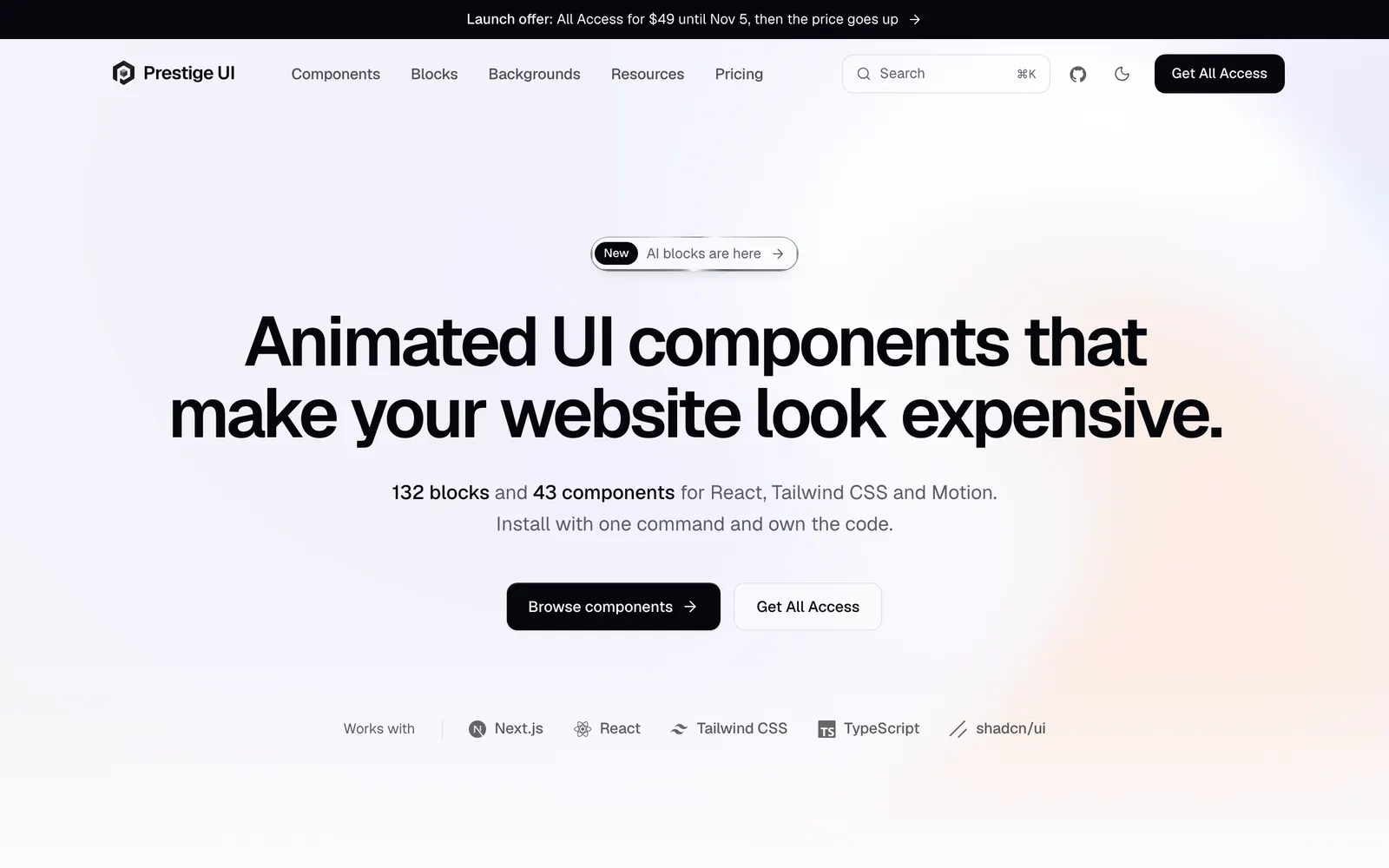
Prestige UI — Animated React components and full-page blocks built with Tailwind CSS and Motion.

Prestige UICollections

Animated React components and full-page blocks built with Tailwind CSS and Motion.

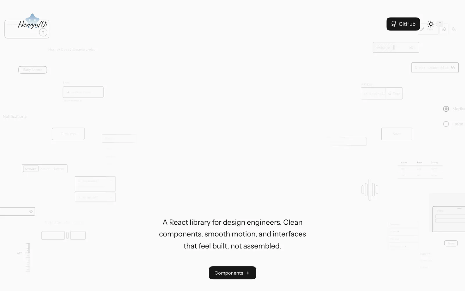
Nexvyn UI — Animated React components with spring physics built on shadcn/ui and Motion.

Nexvyn UICollections

Animated React components with spring physics built on shadcn/ui and Motion.

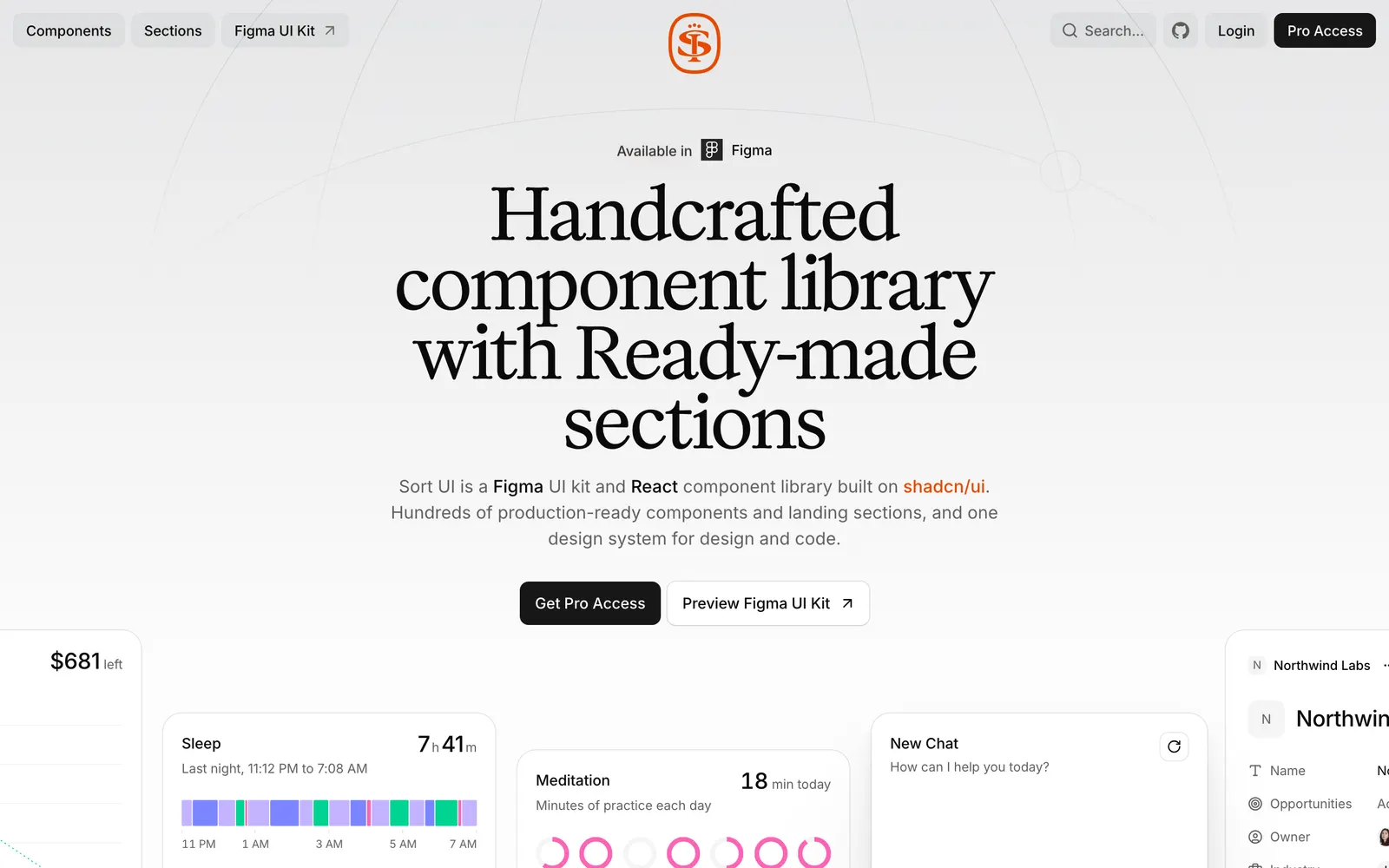
SortUI — Production-grade design system on shadcn/ui with Figma sync and AI components.

SortUICollections

Production-grade design system on shadcn/ui with Figma sync and AI components.

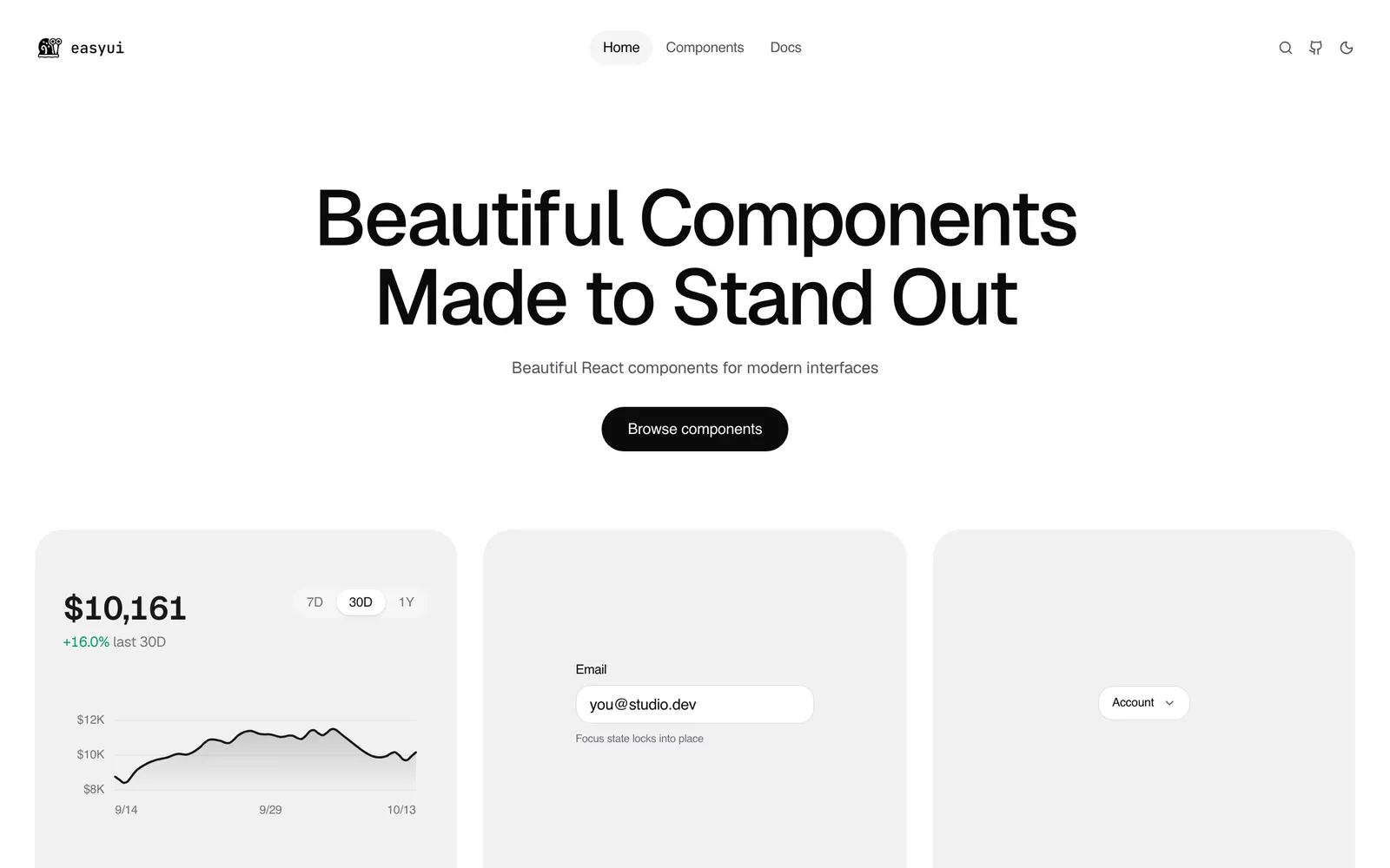
EasyUI — Over 130 production-ready animated React components with shadcn registry support.

EasyUICollections

Over 130 production-ready animated React components with shadcn registry support.

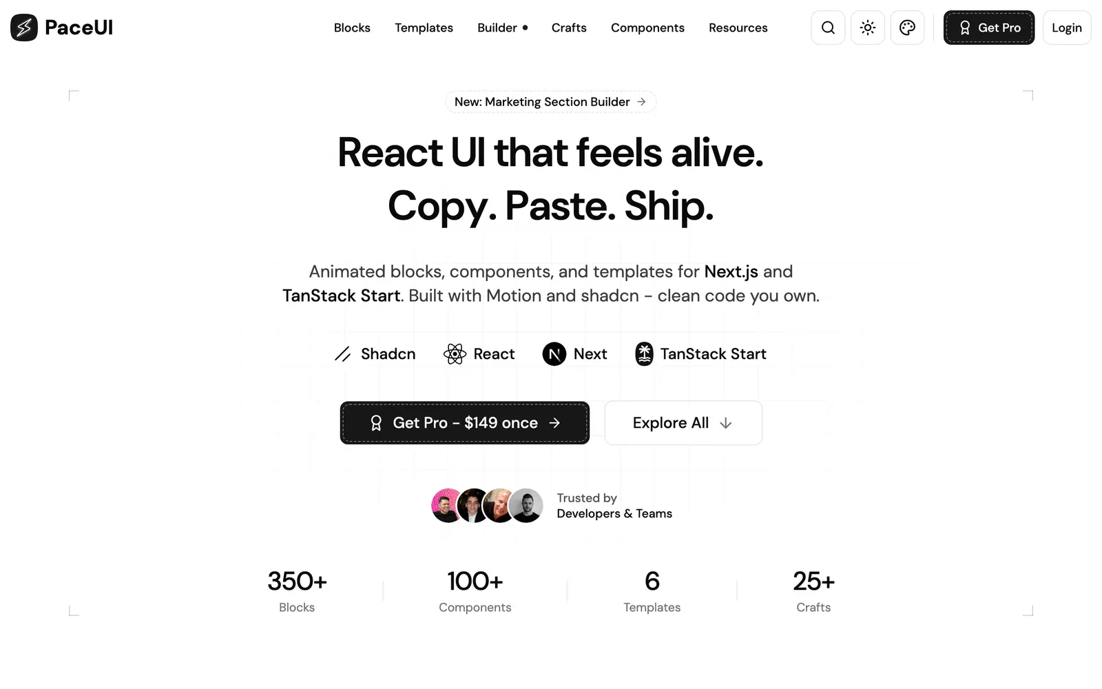
PaceUI — Animated React blocks and crafts for Next.js and TanStack Start with Motion.

PaceUICollections

Animated React blocks and crafts for Next.js and TanStack Start with Motion.

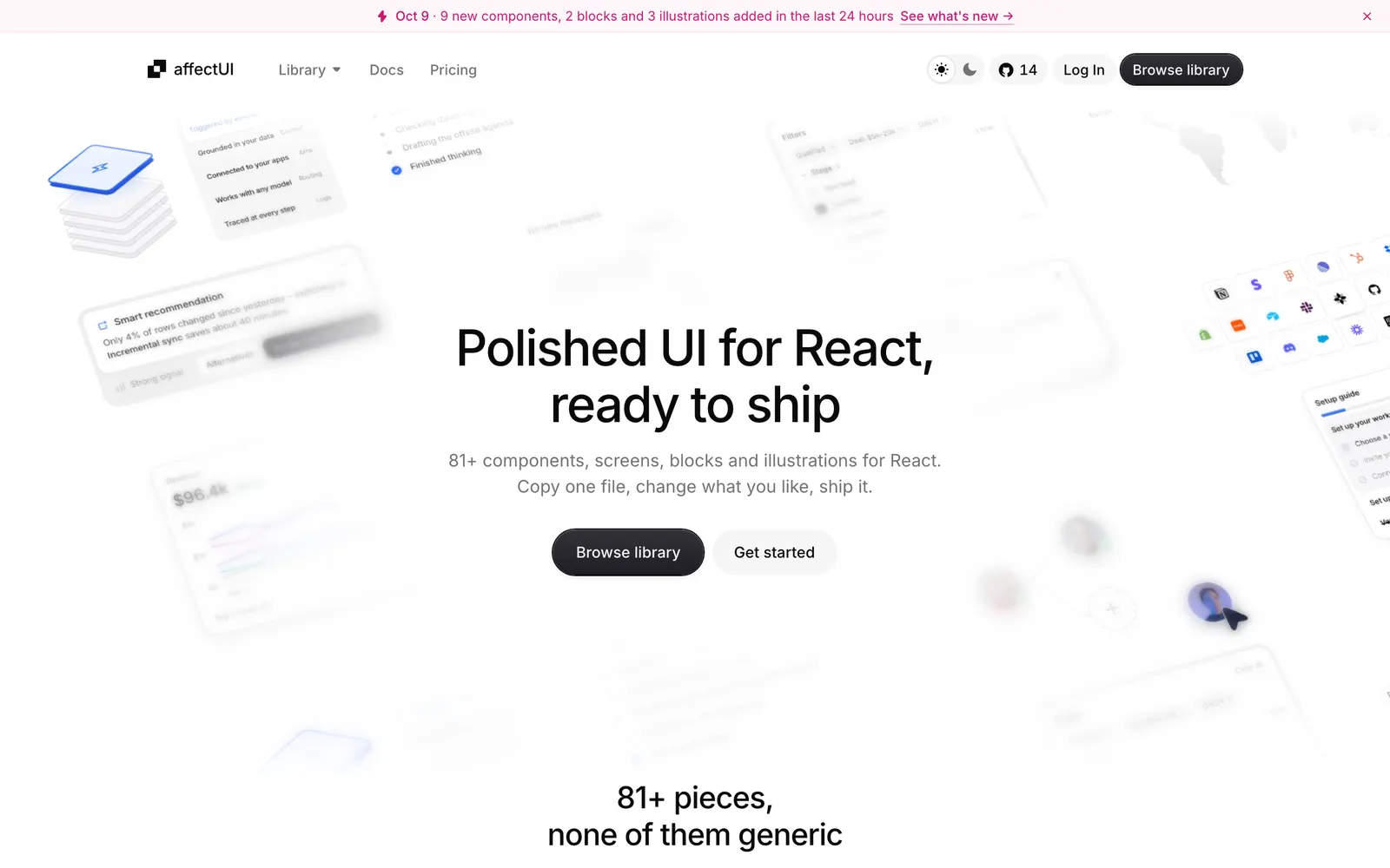
affectUI — Handcrafted React UI components and calm motion for AI apps with zero CSS dependencies.

affectUICollections

Handcrafted React UI components and calm motion for AI apps with zero CSS dependencies.

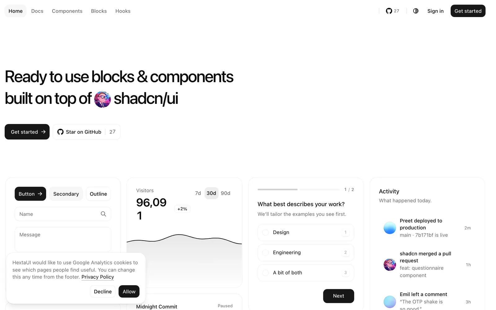
HextaUI — React components and blocks on shadcn/ui and Base UI with built-in motion and states.

HextaUICollections

React components and blocks on shadcn/ui and Base UI with built-in motion and states.

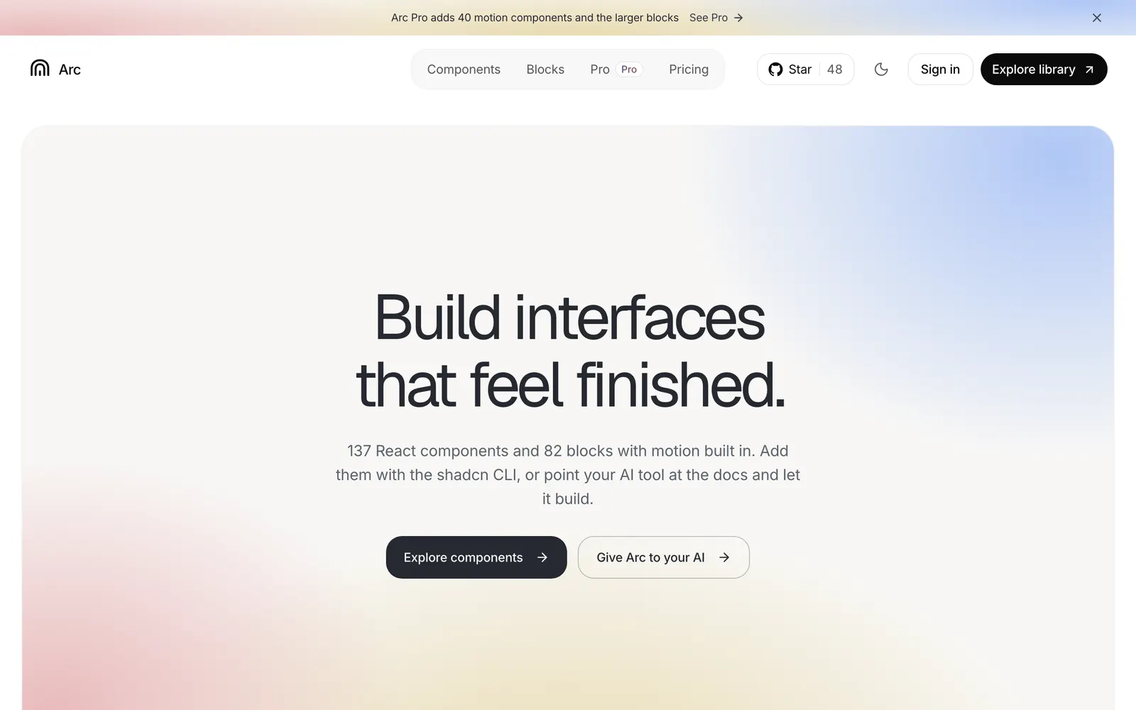
Arc UI — Open-source React components and blocks with calm, polished built-in motion.

Arc UICollections

Open-source React components and blocks with calm, polished built-in motion.

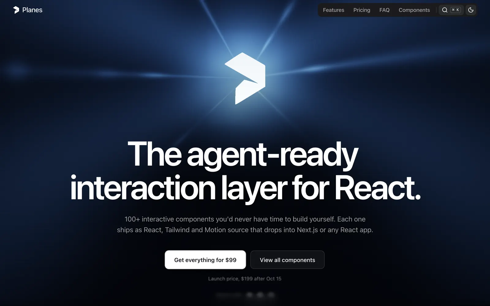
Planes — A high-craft React interaction and motion layer tailored for modern design workflows.

PlanesCollections

A high-craft React interaction and motion layer tailored for modern design workflows.

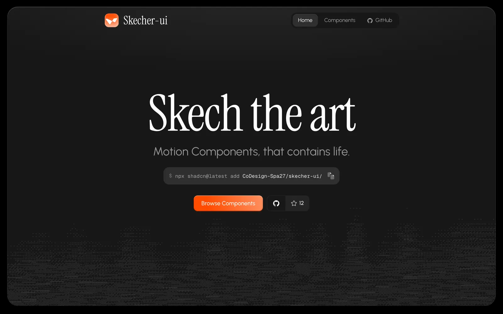
Skecher UI — Polished React motion components and micro-interactions built for the shadcn CLI.

Skecher UICollections

Polished React motion components and micro-interactions built for the shadcn CLI.

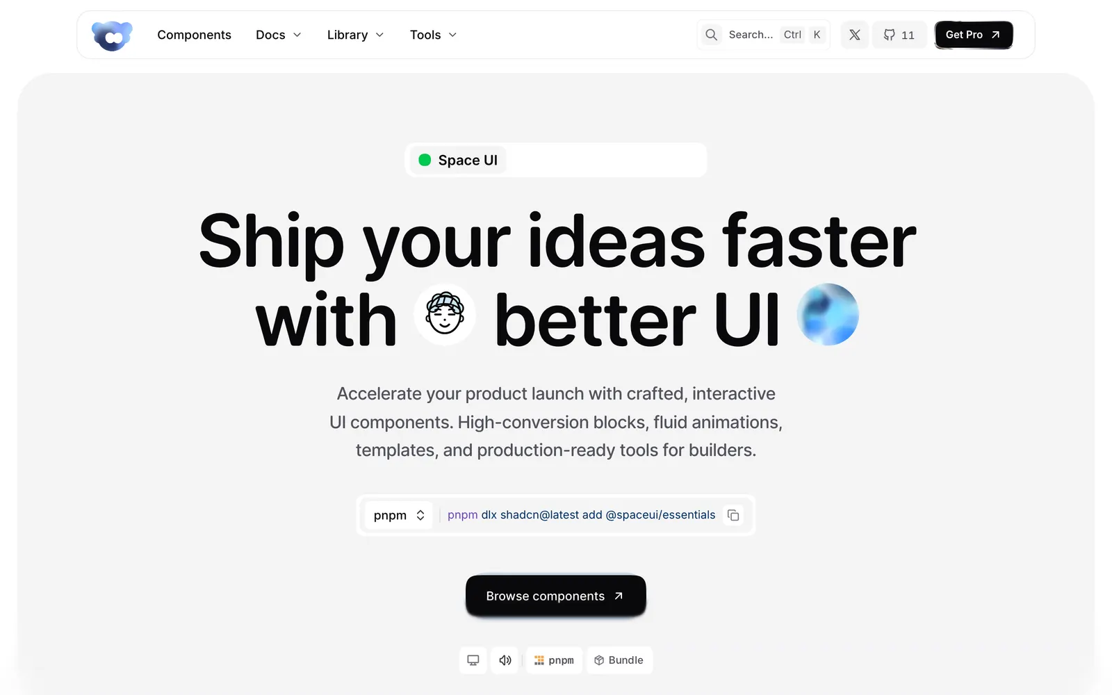
Space UI — Interactive React components, WebGL shaders, and high-conversion landing blocks.

Space UICollections

Interactive React components, WebGL shaders, and high-conversion landing blocks.

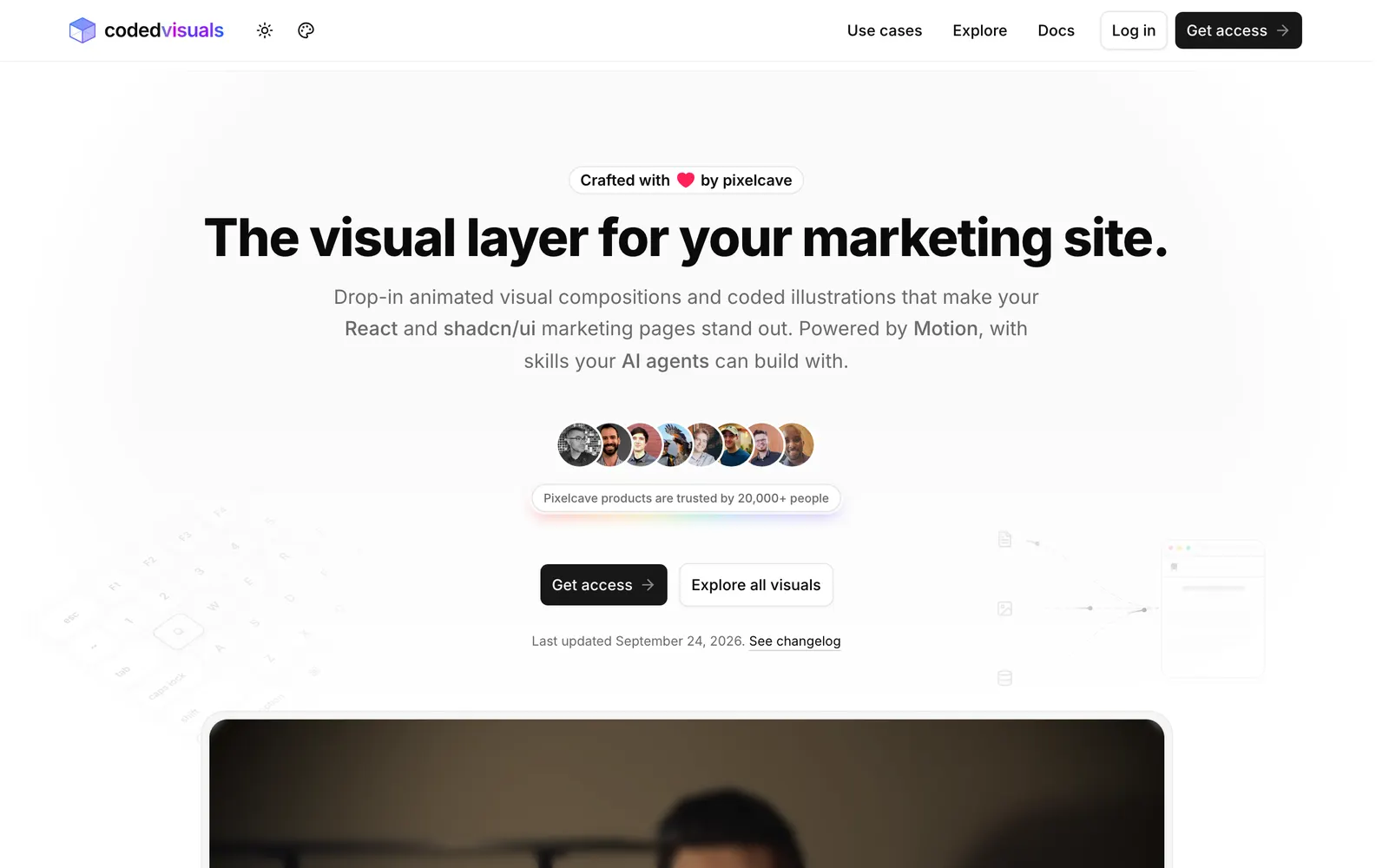
CodedVisuals — Copy-paste animated illustrations and landing visuals for React and shadcn/ui.

CodedVisualsCollections

Copy-paste animated illustrations and landing visuals for React and shadcn/ui.

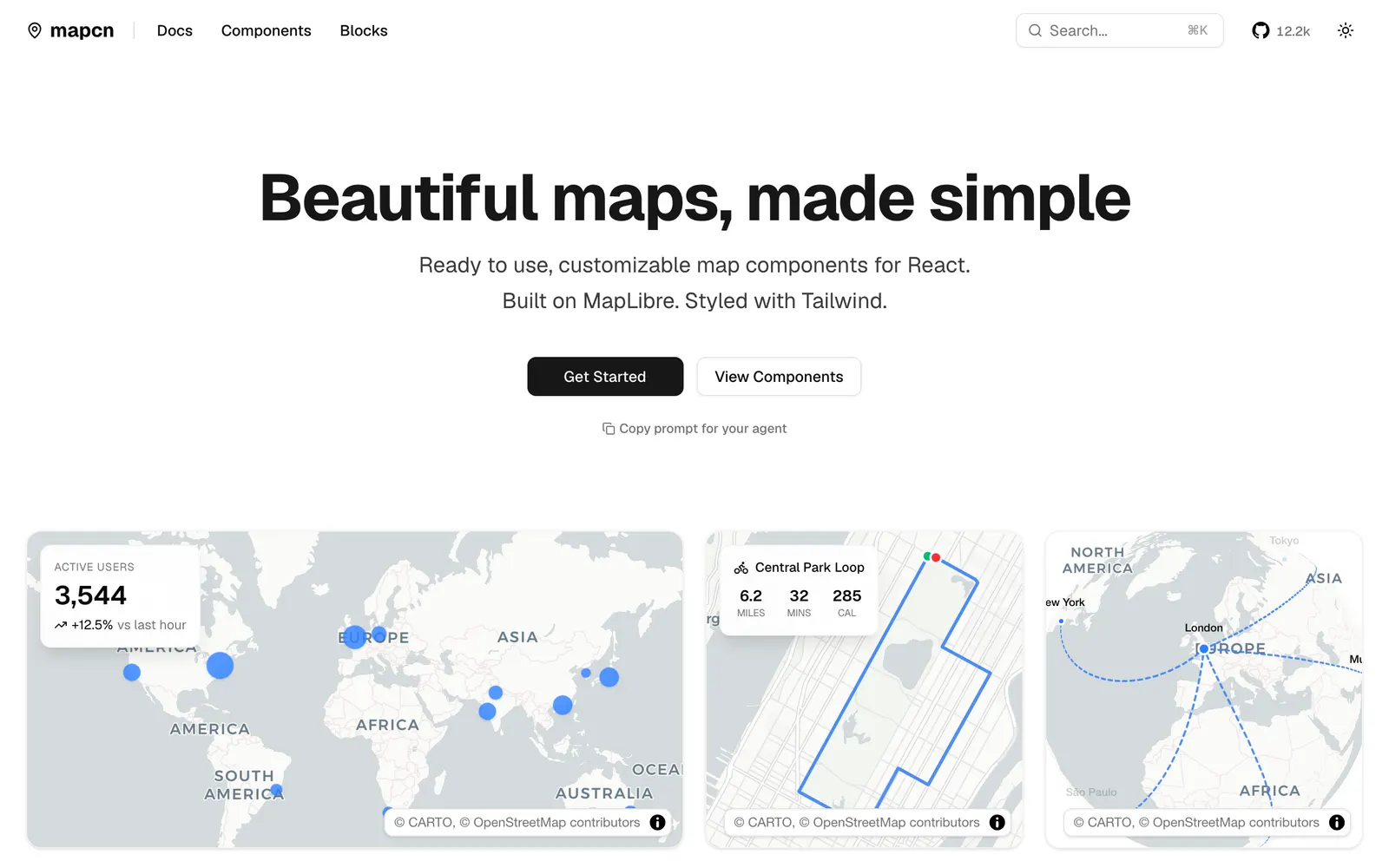
mapcn — Composable React map components built on MapLibre GL and styled with Tailwind CSS.

mapcnData Viz

Composable React map components built on MapLibre GL and styled with Tailwind CSS.

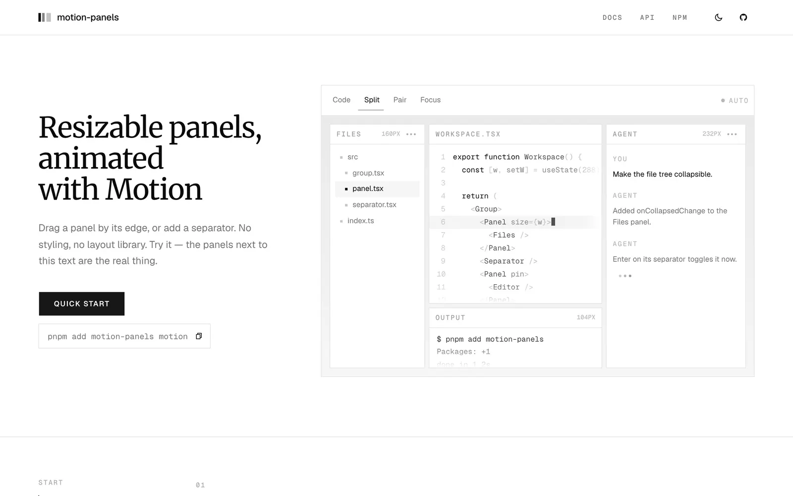
motion-panels — Resizable split panels animated with Motion, featuring smooth folding and snapping.

motion-panelsInput Controls

Resizable split panels animated with Motion, featuring smooth folding and snapping.

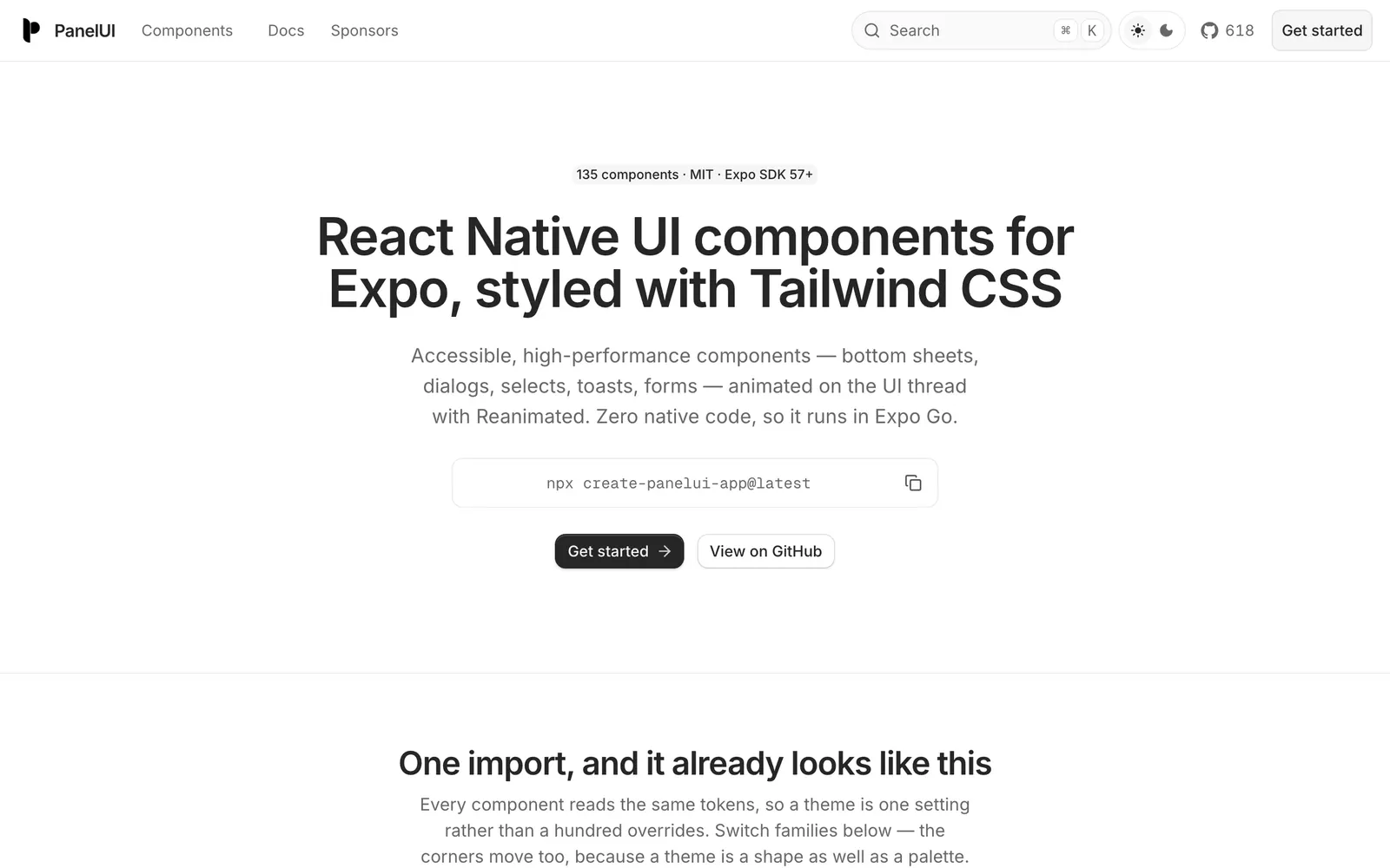
PanelUI — Accessible React Native and Expo component library styled with Tailwind CSS.

PanelUICollections

Accessible React Native and Expo component library styled with Tailwind CSS.

AICSS — Crafted UI components for AI agents: thinking states, tool calls, and streaming text.

AICSSCollections

Crafted UI components for AI agents: thinking states, tool calls, and streaming text.

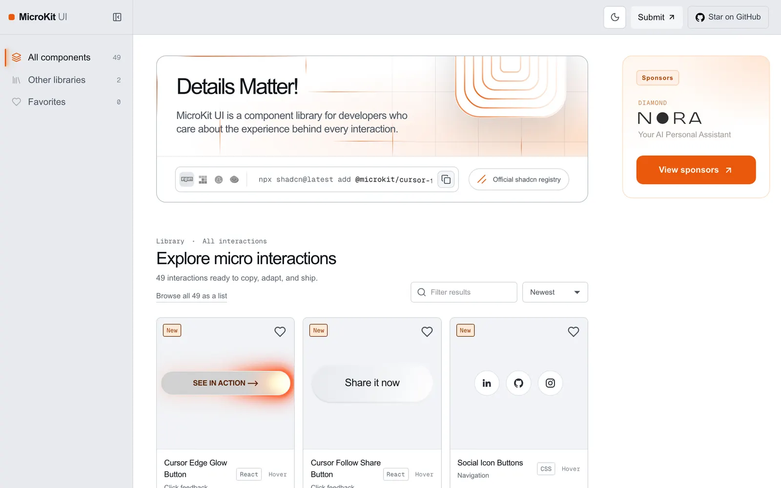
MicroKit UI — Copy-paste microinteractions and subtle UI animations for React and Tailwind.

MicroKit UICollections

Copy-paste microinteractions and subtle UI animations for React and Tailwind.

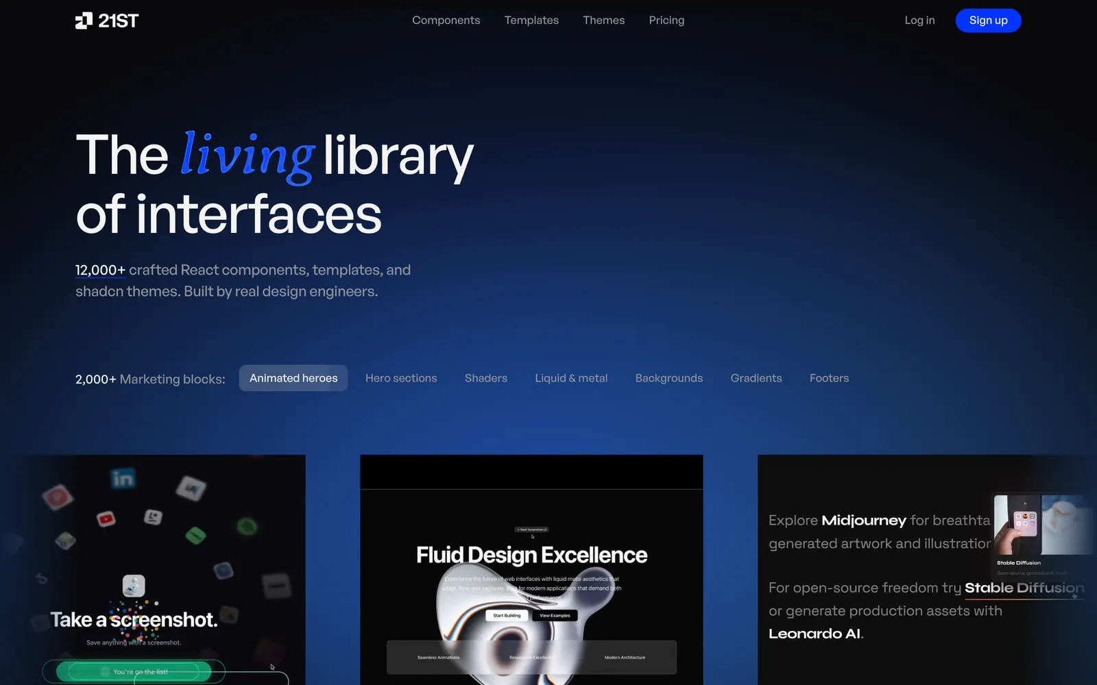
21st.dev — Community registry for shadcn components, motion primitives, and full blocks.

21st.devCollections

Community registry for shadcn components, motion primitives, and full blocks.

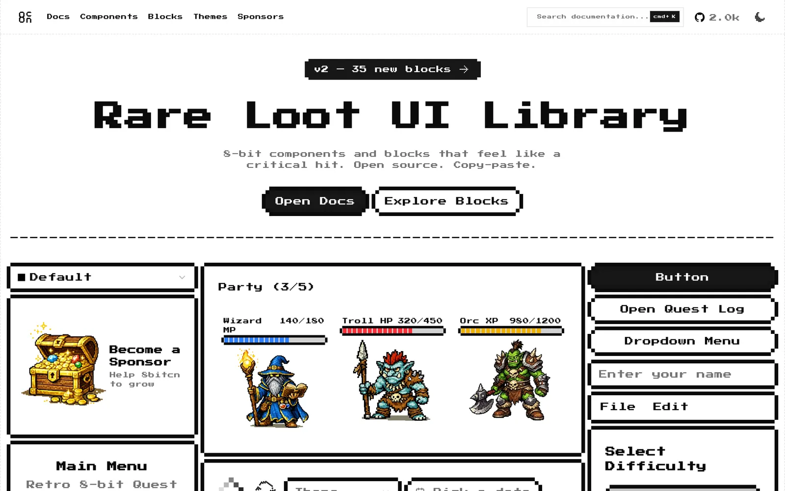
8bitcn — Retro 8-bit pixel art style UI components built on top of shadcn/ui.

8bitcnCollections

Retro 8-bit pixel art style UI components built on top of shadcn/ui.

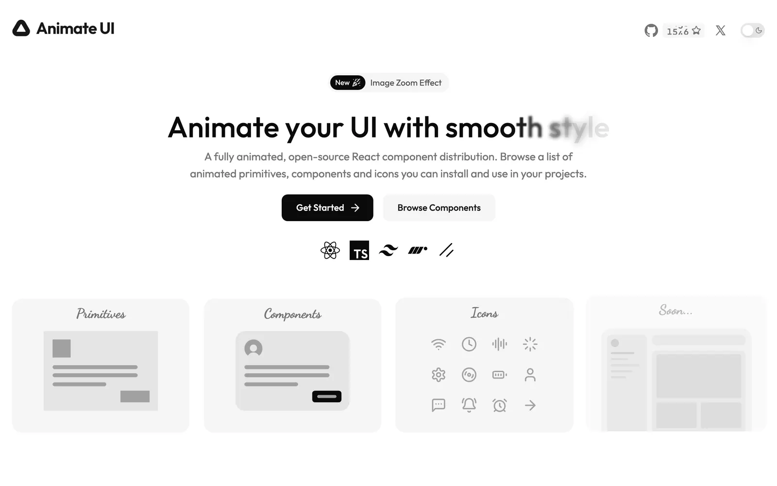
Animate UI — Accessible shadcn UI components beautifully animated with Motion and CSS.

Animate UICollections

Accessible shadcn UI components beautifully animated with Motion and CSS.

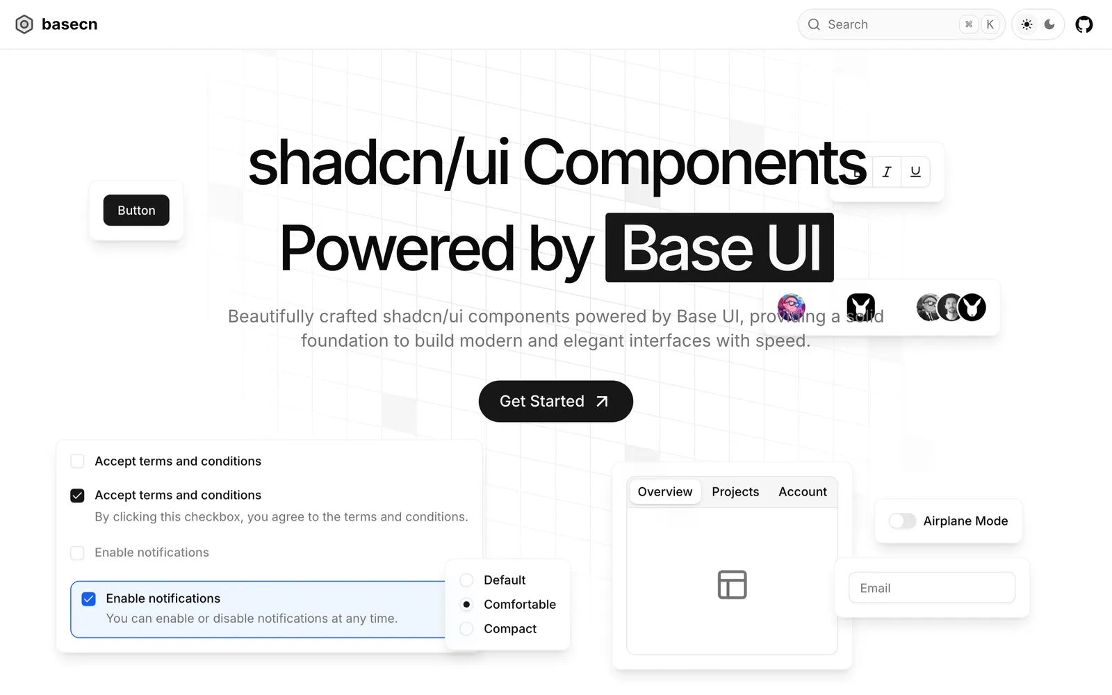
Base CN — Base UI component primitives adapted for the shadcn copy-paste CLI format.

Base CNCollections

Base UI component primitives adapted for the shadcn copy-paste CLI format.

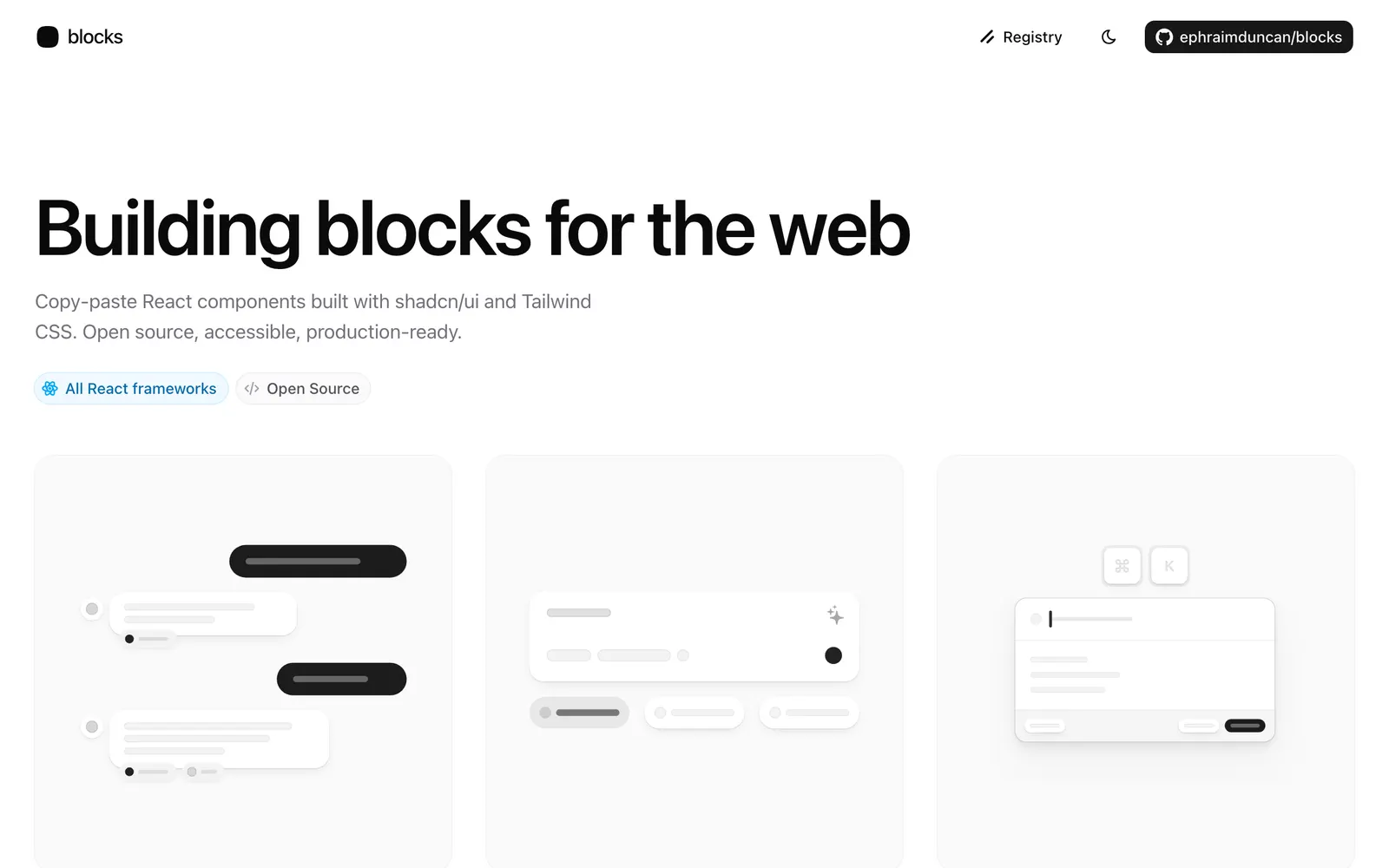
blocks.so — Open-source website blocks and components installable directly via shadcn CLI.

blocks.soCollections

Open-source website blocks and components installable directly via shadcn CLI.

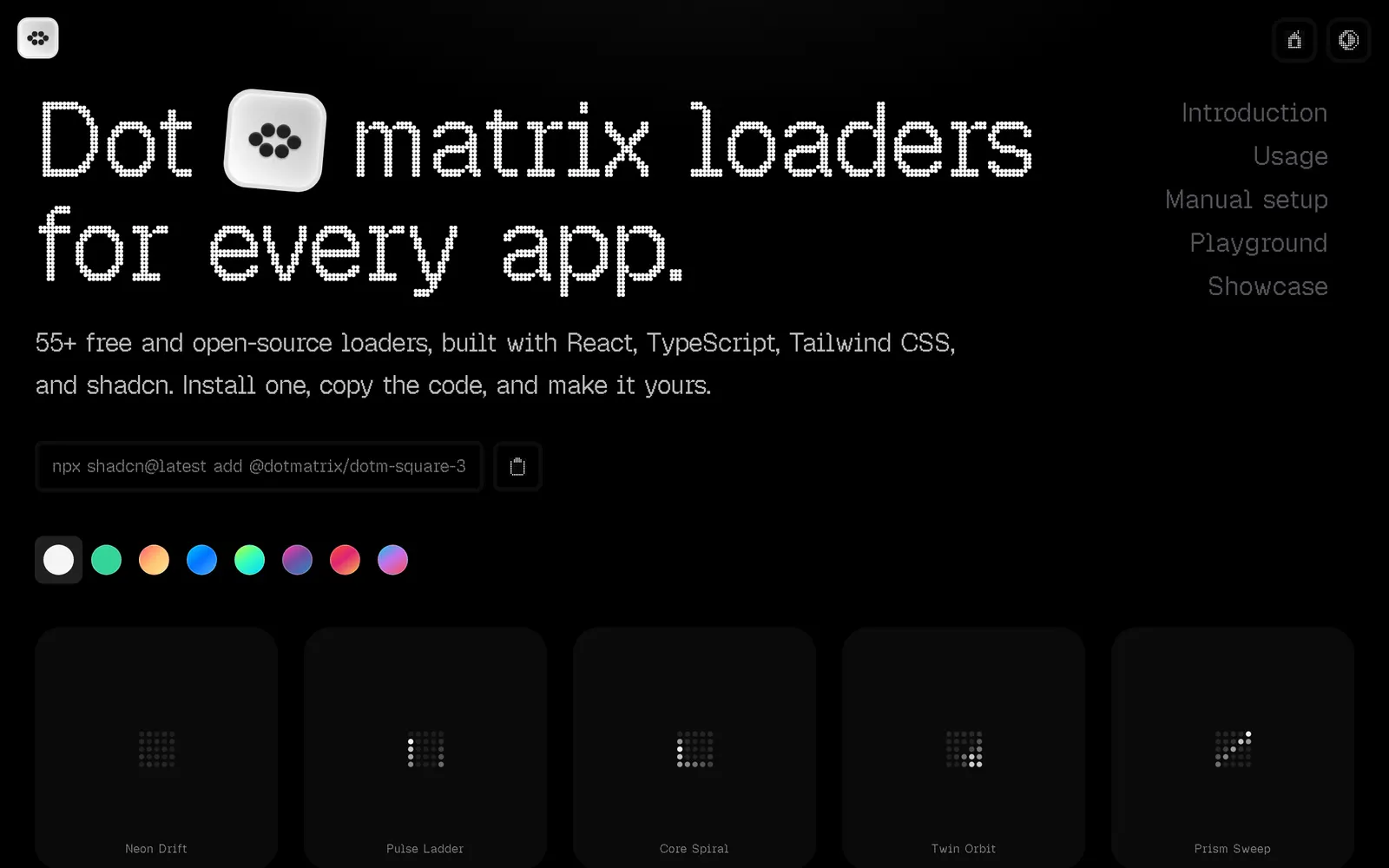
Dot Matrix — Over fifty customizable dot-matrix loaders and pixel indicators for shadcn/ui.

Dot MatrixLoading & Feedback

Over fifty customizable dot-matrix loaders and pixel indicators for shadcn/ui.

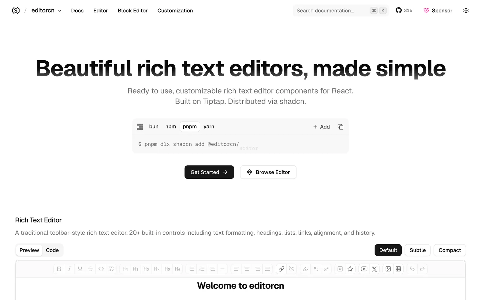
editorcn — Headless rich text editor components for React, built on Tiptap and shadcn.

editorcnFiles & Code

Headless rich text editor components for React, built on Tiptap and shadcn.

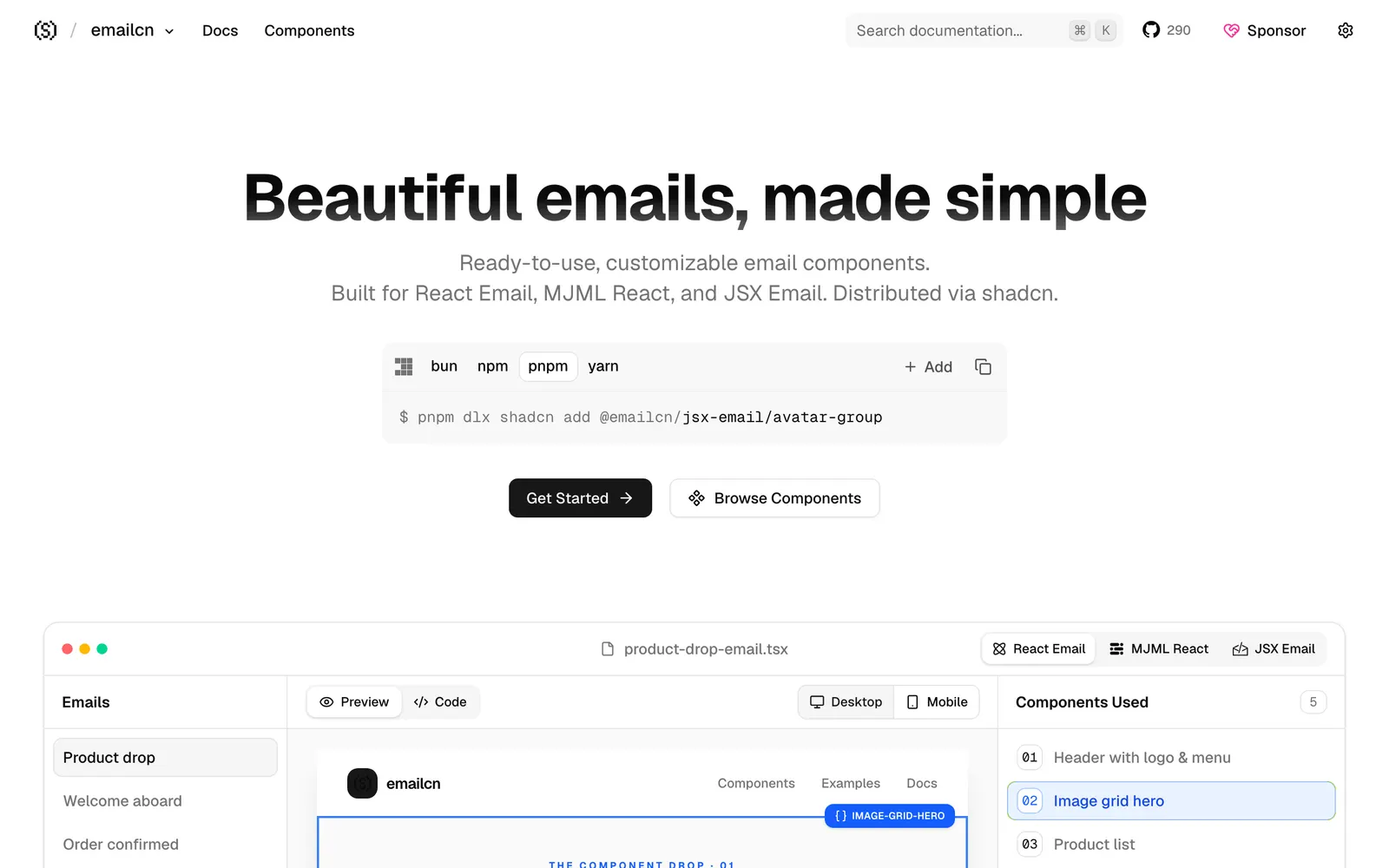
emailcn — Responsive email components compatible with React Email, MJML, and JSX Email.

emailcnCollections

Responsive email components compatible with React Email, MJML, and JSX Email.

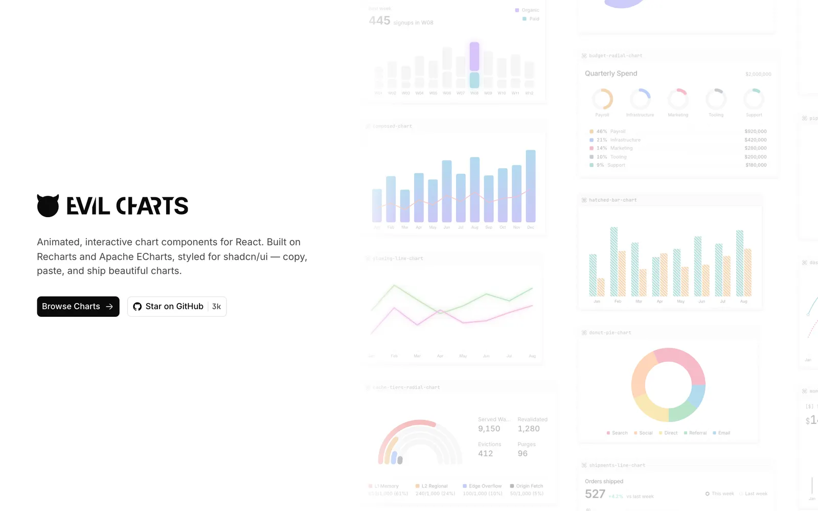
Evil Charts — Animated SVG charts designed specifically for shadcn/ui with minimal weight.

Evil ChartsData Viz

Animated SVG charts designed specifically for shadcn/ui with minimal weight.

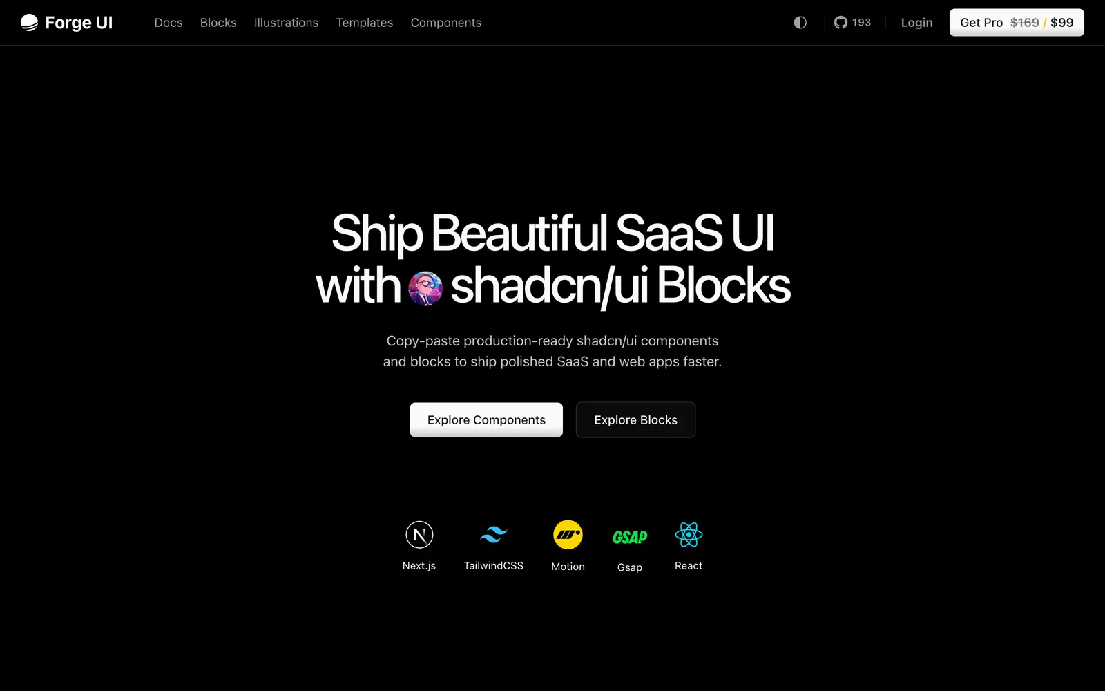
Forge UI — Animated React and Tailwind UI components and blocks compatible with shadcn/ui.

Forge UICollections

Animated React and Tailwind UI components and blocks compatible with shadcn/ui.

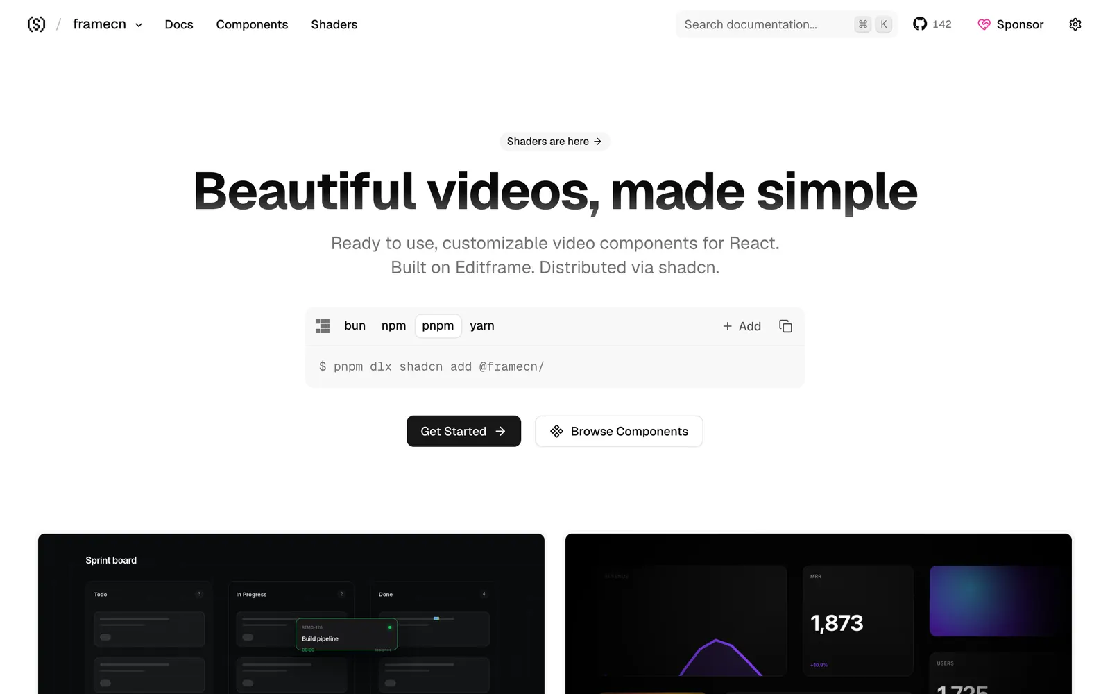
framecn — Video rendering and timeline components for React, built on Editframe.

framecnCollections

Video rendering and timeline components for React, built on Editframe.

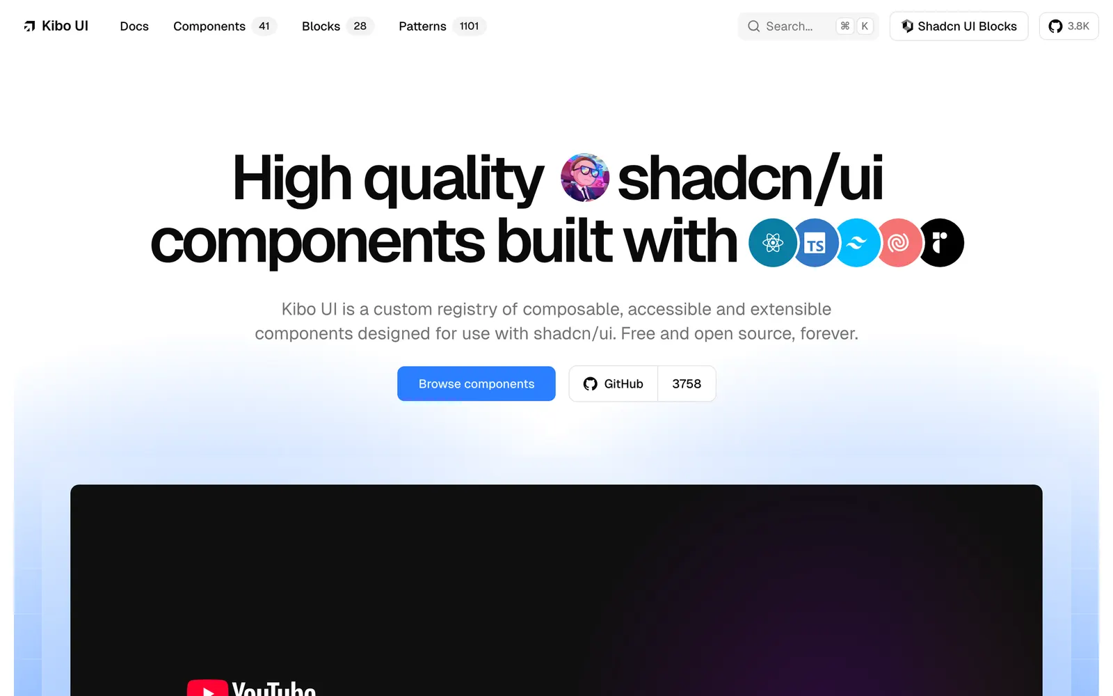
Kibo UI — Component registry tailored for AI interfaces, chat experiences, and workflows.

Kibo UICollections

Component registry tailored for AI interfaces, chat experiences, and workflows.

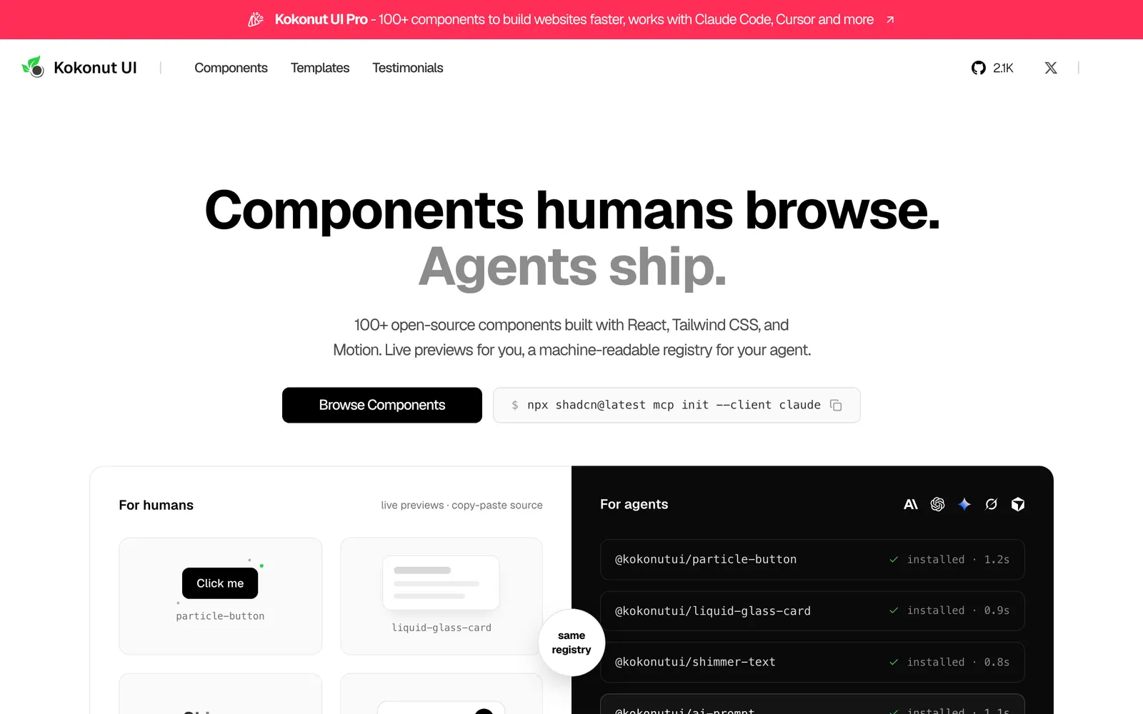
Kokonut UI — Creative interactive components for React and Tailwind in shadcn format.

Kokonut UICollections

Creative interactive components for React and Tailwind in shadcn format.

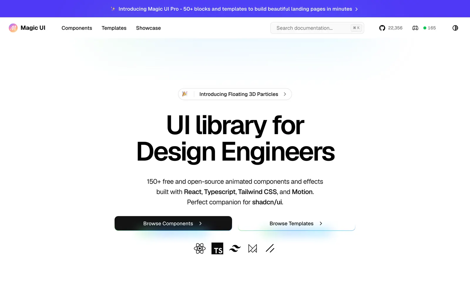
Magic UI — Over 150 animated components crafted for landing pages and modern products.

Magic UICollections

Over 150 animated components crafted for landing pages and modern products.

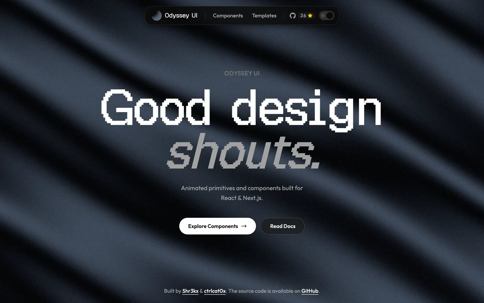
Odyssey UI — Animated React components built on shadcn/ui and Framer Motion for SaaS.

Odyssey UICollections

Animated React components built on shadcn/ui and Framer Motion for SaaS.

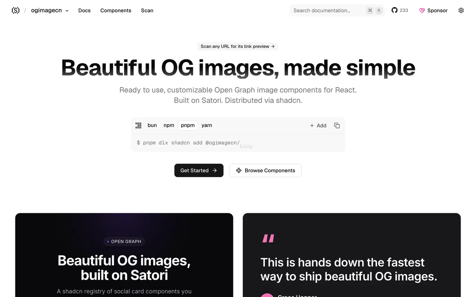
ogimagecn — Dynamic Open Graph image components and generator using Satori and shadcn.

ogimagecnFiles & Code

Dynamic Open Graph image components and generator using Satori and shadcn.

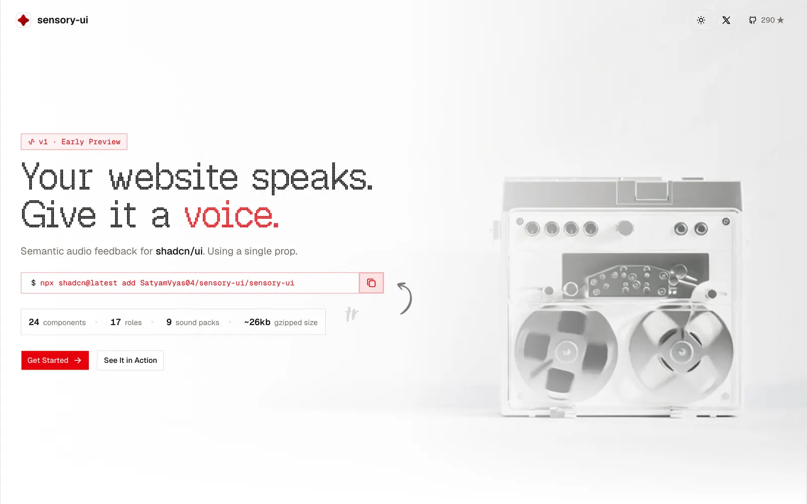
sensory-ui — Sound design system and acoustic tactile feedback for shadcn/ui components.

sensory-uiLoading & Feedback

Sound design system and acoustic tactile feedback for shadcn/ui components.

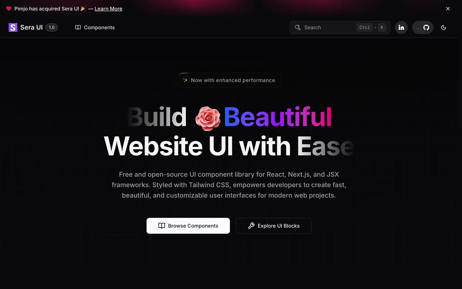
Sera UI — Minimalist React components designed for effortless shadcn CLI integration.

Sera UICollections

Minimalist React components designed for effortless shadcn CLI integration.

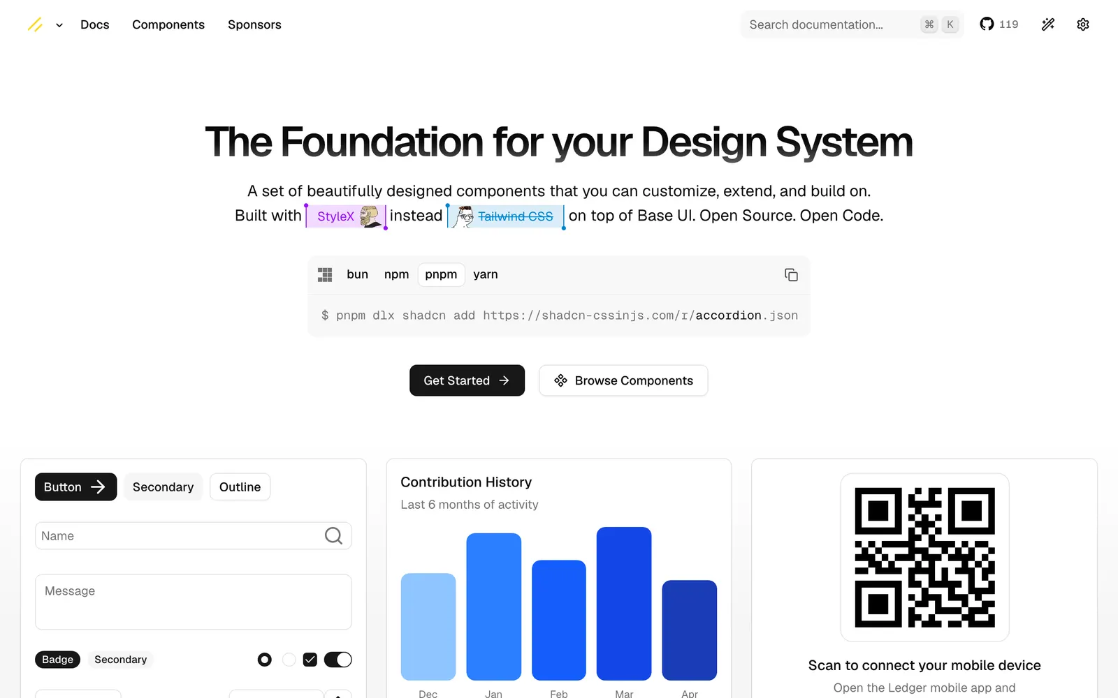
shadcn-cssinjs — shadcn UI components re-engineered for emotion and styled-components setups.

shadcn-cssinjsCollections

shadcn UI components re-engineered for emotion and styled-components setups.

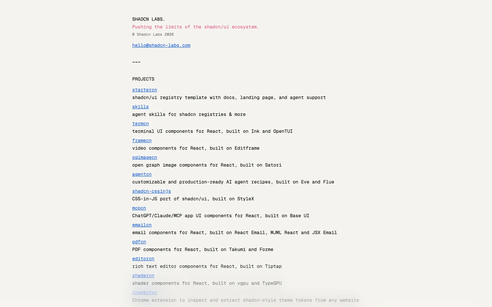
Shadcn Labs — Curated ecosystem and exploration lab for emerging shadcn/ui community registries.

Shadcn LabsCollections

Curated ecosystem and exploration lab for emerging shadcn/ui community registries.

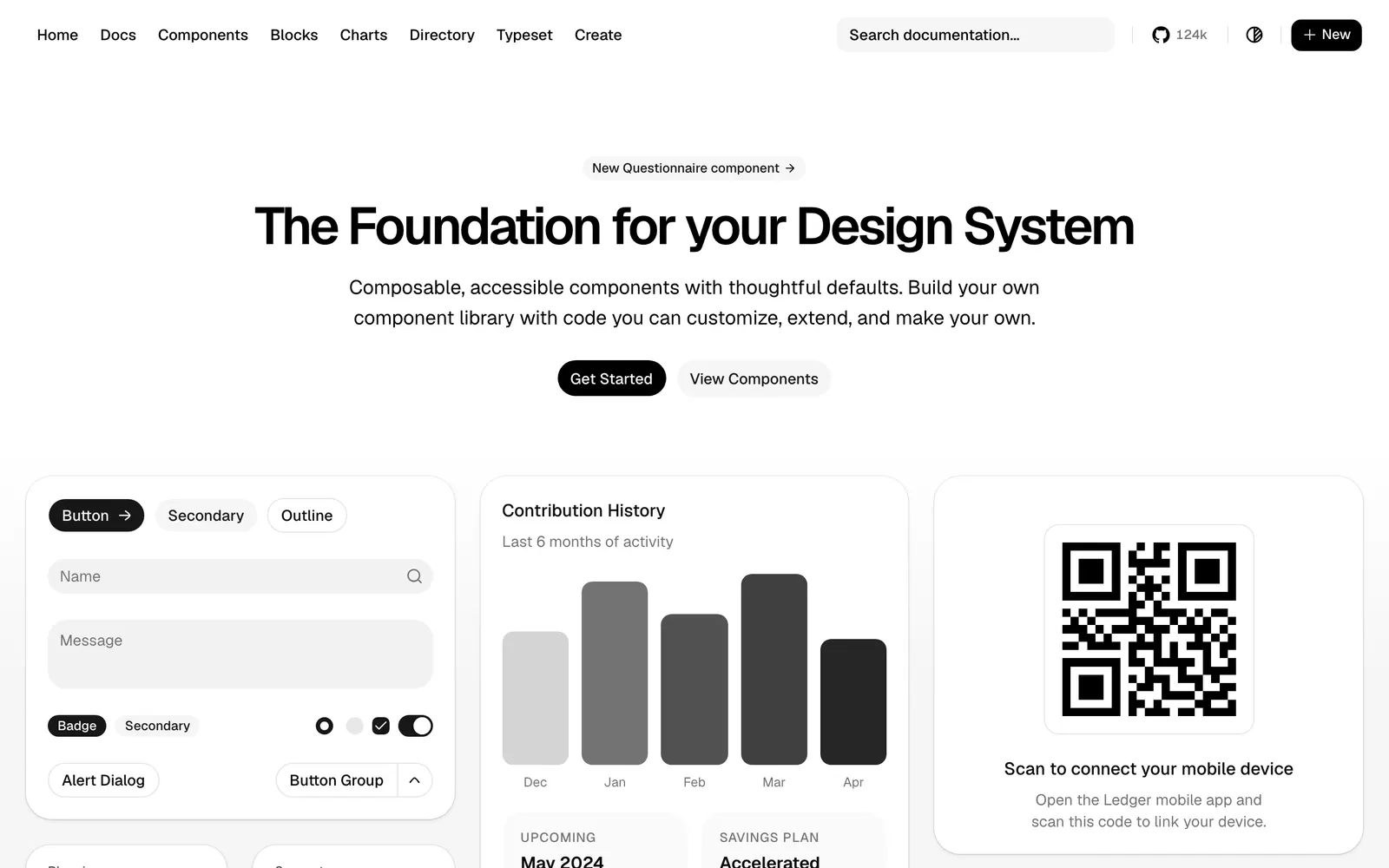
shadcn/ui — Beautifully designed components that you can copy and paste into your apps.

shadcn/uiCollections

Beautifully designed components that you can copy and paste into your apps.

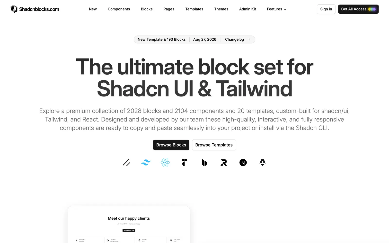
shadcnblocks — Comprehensive library of ready-to-use shadcn website blocks and UI sections.

shadcnblocksCollections

Comprehensive library of ready-to-use shadcn website blocks and UI sections.

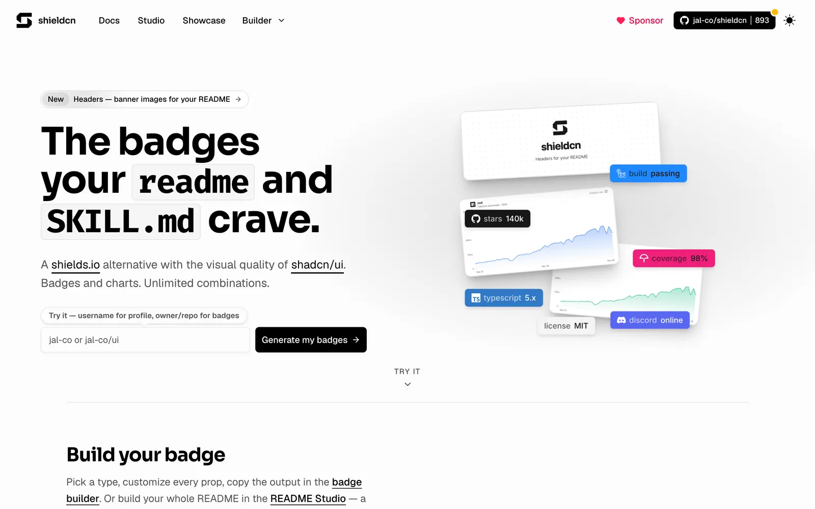
shieldcn — GitHub README badges and status shields styled with clean shadcn aesthetics.

shieldcnFiles & Code

GitHub README badges and status shields styled with clean shadcn aesthetics.

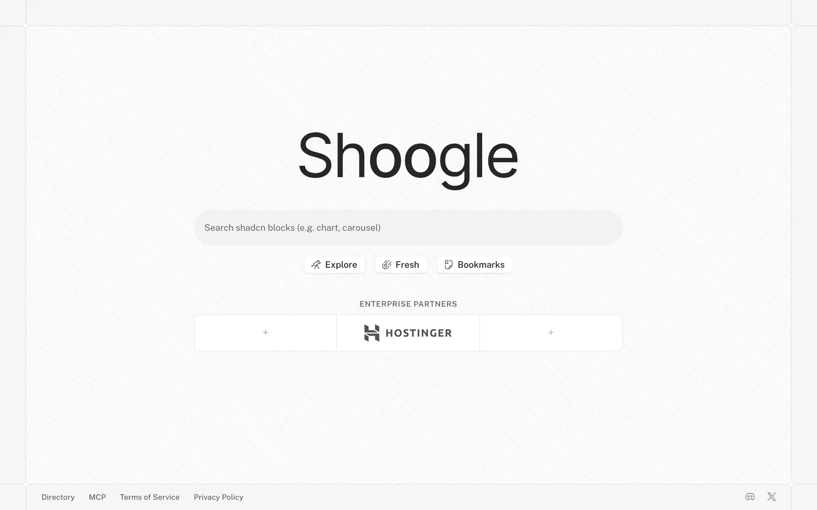
Shoogle — Specialized search engine spanning the growing ecosystem of shadcn registries.

ShoogleCollections

Specialized search engine spanning the growing ecosystem of shadcn registries.

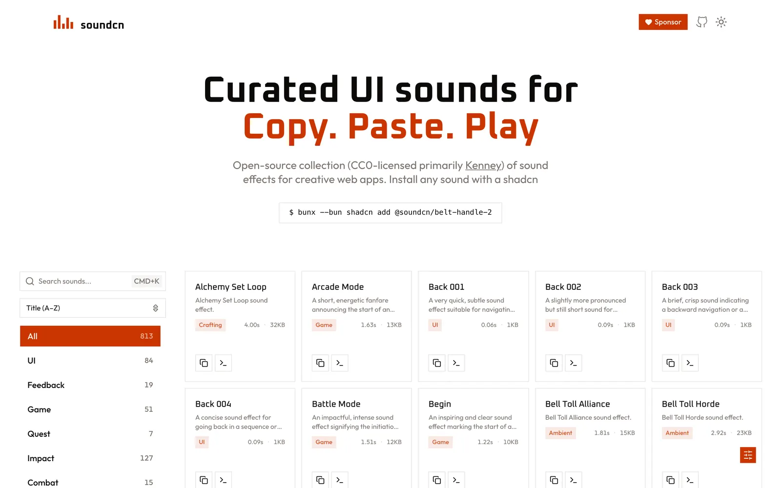
soundcn — Curated collection of copy-paste UI sound effects and audio hooks for the web.

soundcnLoading & Feedback

Curated collection of copy-paste UI sound effects and audio hooks for the web.

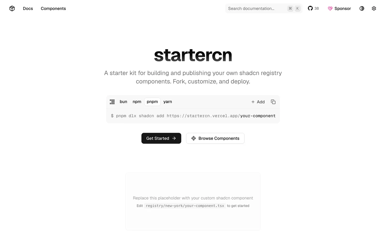
startercn — Comprehensive shadcn/ui registry template with docs, landing page, and AI agent support.

startercnCollections

Comprehensive shadcn/ui registry template with docs, landing page, and AI agent support.

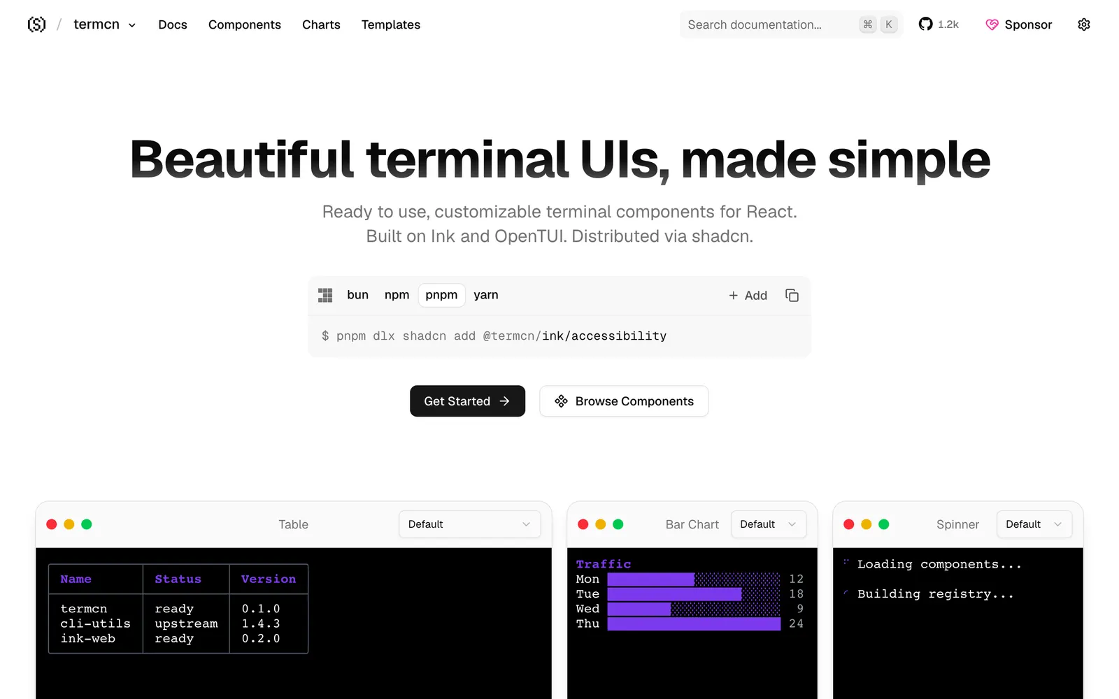
termcn — Terminal UI components for React, built on Ink, OpenTUI, and shadcn conventions.

termcnFiles & Code

Terminal UI components for React, built on Ink, OpenTUI, and shadcn conventions.

Uiuno — AI-assisted workspace for discovering, previewing, and organizing shadcn components.

UiunoCollections

AI-assisted workspace for discovering, previewing, and organizing shadcn components.

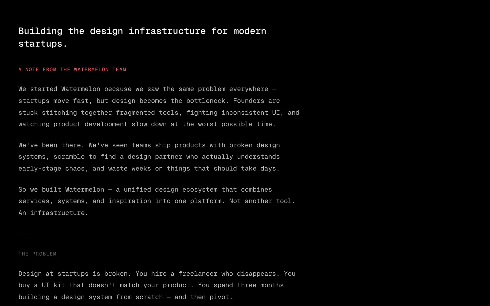
Watermelon UI — Fresh, colorful React component collection expanding the shadcn ecosystem.

Watermelon UICollections

Fresh, colorful React component collection expanding the shadcn ecosystem.

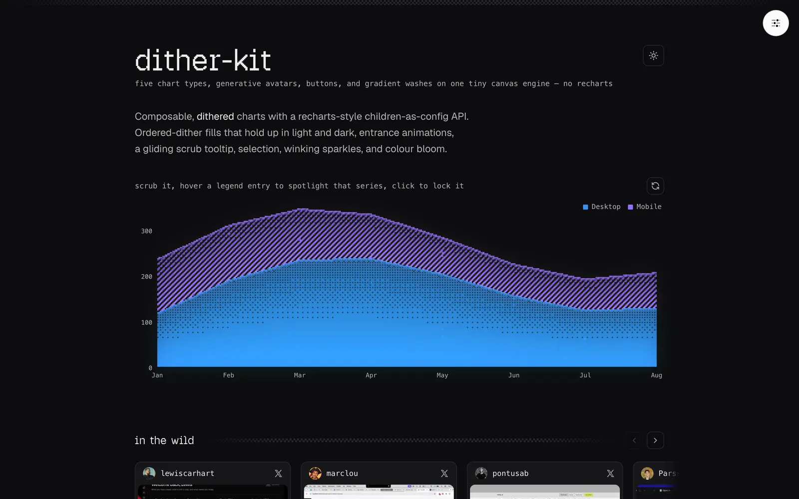
Dither Kit — Composable dithered charts and components for shadcn/ui on a tiny canvas engine.

Dither KitData Viz

Composable dithered charts and components for shadcn/ui on a tiny canvas engine.

Rare UI — A curated registry of rare animated React components built with Motion and shadcn.

Rare UICollections

A curated registry of rare animated React components built with Motion and shadcn.

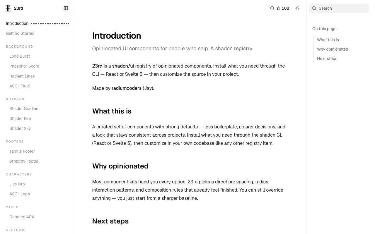
23rd — An opinionated shadcn/ui registry of high-character components for React and Svelte 5, featuring ASCII fluid, GLSL shaders, and organic motion.

23rdCollections

An opinionated shadcn/ui registry of high-character components for React and Svelte 5, featuring ASCII fluid, GLSL shaders, and organic motion.

Spectrum UI — Open-source, animation-ready React components and blocks built with Next.js, Tailwind CSS, Motion, TypeScript, and shadcn/ui for SaaS and AI apps.

Spectrum UICollections

Open-source, animation-ready React components and blocks built with Next.js, Tailwind CSS, Motion, TypeScript, and shadcn/ui for SaaS and AI apps.

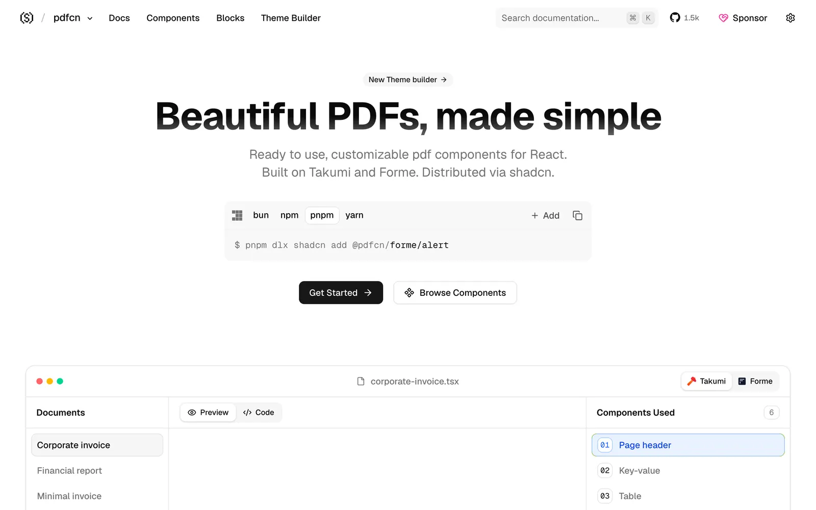
pdfcn — Free & open-source, ready-to-use, customizable PDF components for React. Copy, paste, and ship. Built on Takumi and Forme, works with shadcn/ui.

pdfcnFiles & Code

Free & open-source, ready-to-use, customizable PDF components for React. Copy, paste, and ship. Built on Takumi and Forme, works with shadcn/ui.

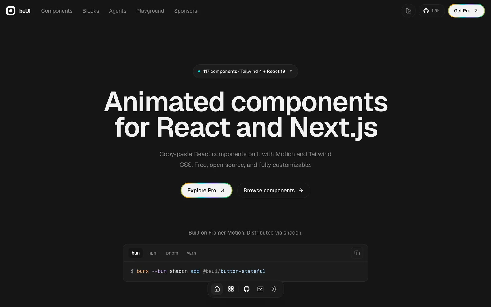
beUI — Free, open-source animated components for React and Next.js, built with Motion and Tailwind CSS. Copy the source or install with the shadcn CLI.
beUICollections

Free, open-source animated components for React and Next.js, built with Motion and Tailwind CSS. Copy the source or install with the shadcn CLI.